How to use clip-path to create unique image shapes and effect

Hello, welcome back to my page! I'm excited to talk about another CSS property today, the Clip-path. I've been really into this property lately and have been spending a lot of time trying to understand it better. This article will help you understand what the Clip-path is and how to use it.
I'll also show you some videos and share my code to demonstrate some cool things you can do with it. Keep in mind this article will be in two parts, so watch out for the next one.
Let's dive in!
What is clip-path?
clip-path is a CSS property that allows you to specify which part of an element should be visible while hiding the rest. It is a powerful and exciting property to work with. Recently, I made a post on Twitter and LinkedIn about how I achieved a slanted div on my portfolio website using another div and a couple of CSS transform properties. But now, I can achieve the same thing in just one line of code using just the clip-path property.
The clip-path property takes different functions depending on what you want to achieve, but in this article, we'll mostly be using the polygon() function. However, it's worth noting that there are also others like the insert(), circle(), ellipse() and url() functions. I'll cover them in another article.
If you're interested in understanding and creating cool stuff with clip-path, keep reading!
Let me show you what the clip-path syntax looks like to better understand what I'm saying.
CODE 1
You may be wondering how difficult it is to generate the coordinates for clip-path yourself. But don't worry; it's not as hard as you think. There's a tool called Clippy that makes it easy for you. With Clippy, you can easily draw out your desired image, and all you have to do is copy the clip-path code.
When using Clippy, you have the option to select an existing shape or use the custom polygon tool to draw out your own unique shape. It's a great way to simplify the process and make it more accessible to everyone.

Now that you have a better understanding of the clip-path property and how it works, let's move on to practical projects and explore how to achieve them.
How to create a slanted div using clip-path.
This is the bottom of a div. To achieve this, here is the code you can use:
( If this is not the design you want to achieve, it is not possible to provide the code for all designs you want to achieve, but you can use the tool Clippy to generate the code for the desired shape and copy-paste it to your CSS).
HTML
CSS
.header{
height: 95vh;
background-image: linear-gradient(to right bottom, rgb(126, 213, 111,0.8), rgba(40, 180, 133, 0.8)), url(../img/hero.jpg) ;
background-size: cover;
background-position: top;
/* Define a custom clipping path for the element */
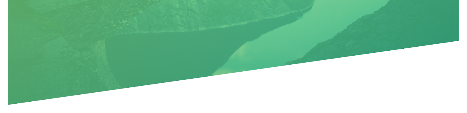
clip-path: polygon(0 0 , 100% 0, 100% 75%, 0 100%);
}
If you take a look at the code, you'll see that we only used the clip-path property to achieve the slant effect. It's a simple yet powerful way to create unique designs without the need for additional elements or complex code.
How to create the image hover effect using clip-path.
I had fun learning this one because just think about all the amazing stuff you could do with it. With this property, you can easily create unique designs without the need for additional elements or complex code.
I will be adding the clippy image only in this section so as not to overwhelm you with images.
So, here is my HTML code
The CSS code
body {
 /* Setting the margin and padding to 0, and background color to #555 */
 margin: 0;
 padding: 0;
 background-color: #555;
 /* Setting the height of the body to 100vh and display to flex */
 height: 100vh;
 display: flex;
 /* Centering the content horizontally and vertically */
 justify-content: center;
 align-items: center;
}


.container{
 /* Positioning the container relatively */
 position: relative;
 /* Setting the width and height of the container */
 width: 800px;
 height: 500px;
 /* Setting the background color of the container */
 background-color: #555;
}


.clip{
 /* Positioning the clip element absolutely, so it stays within the container */
 position: absolute;
 /* Positioning the clip element at the top left corner of the container */
 top: 0;
 left: 0;
 /* Setting the width and height of the clip element to 100% */
 width: 100%;
 height: 100%;
 /* Adding transition effect for when the clip element is hovered over */
 transition: all 0.5s;
}


.clip1{
 /* Setting the background of the clip1 element to image3.jpg and covering it fully */
 background: url(image/image3.jpg);
 background-size: cover;
 background-position: center;
 /* Using the clip-path property to create a slanted shape on the clip1 element */
 clip-path: polygon(0 0, 17% 0, 49% 100%, 0 100%);
}


.clip2{
 /* Setting the background of the clip2 element to image1.jpg and covering it fully */
 background: url(image/image1.jpg);
 background-size: cover;
 background-position: center;
 /* Using the clip-path property to create a slanted shape on the clip2 element */
 clip-path: polygon(13% 0, 81% 0, 59% 100%, 36% 100%);
}


.clip3{
 /* Setting the background of the clip3 element to image2.jpg and covering it fully */
 background: url(image/image2.jpg);
 background-size: cover;
 background-position: center;
 /* Using the clip-path property to create a slanted shape on the clip3 element */
 clip-path: polygon(79% 0, 100% 0, 100% 100%, 59% 100%);
}


.container:hover .clip{
 /* On hover of the container, move all the points of the clip element to the right so that it will be hidden */
 clip-path: polygon(100% 0, 100% 0, 100% 100%, 100% 100%);
}


.container .clip:hover{
 /* On hover of the clip element, make the full point visible */
 clip-path: polygon(0 0, 100% 0, 100% 100%, 0 100%);
}
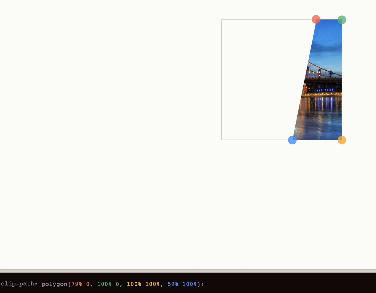
This image is from clippy and is used to determine the portion of the third image that will be visible.
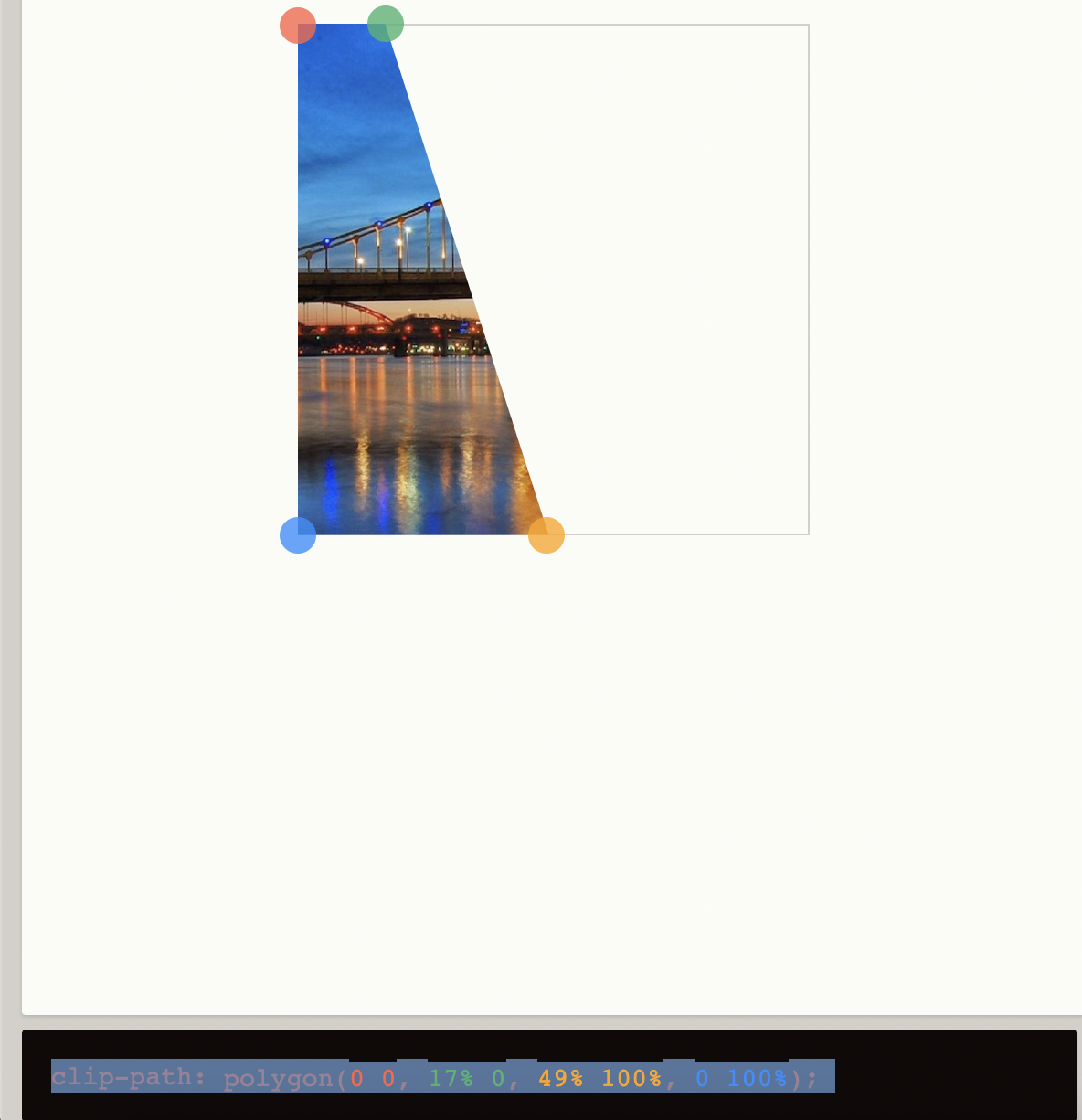
This image is from clippy and is used to determine the portion of the first image that will be visible.

This image is from clippy and is used to determine the portion of the center image that will be visible.

An image representation of where this comment is, /* Go on clippy, move all the points to the right so that on hover, they will be hidden */

An image representation of where this comment is /* Go on clippy, make the full point visible */
Pretty cool, right?
How to create cool wavy effect using clip-path.
The code provided will assist you in replicating the wavy effect demonstrated in the video.
The HTML
The CSS
body {
  /* Set the background color to a dark gray */
  background-color: #2f2f2f;
  /* Set the height of the body to 100% of the viewport height */
  height: 100vh;
  /* Enable flexbox layout for the body */
  display: flex;
  /* Center the content horizontally within the body */
  justify-content: center;
  /* Center the content vertically within the body */
  align-items: center;
}

.wave{
  /* Set the position of the wave element to relative */
  position:relative;
  /* Set the width and height of the wave element to 500px */
  width: 500px;
  height: 500px;
}

h2{
  /* Set the position of the h2 text to absolute */
  position: absolute;
  /* Center the text within the element */
  text-align: center;
  /* Convert the text to uppercase */
  text-transform: uppercase;
  /* Set the line height of the text to match the height of the wave element */
  line-height: 500px;
  /* Set the font size of the text to 170px */
  font-size: 170px;
}

h2:nth-child(1){
  /* Set the color of the first h2 element to transparent */
  color: transparent;
  /* Add a 2px wide stroke around the text in the color #aa2347 */
  -webkit-text-stroke: 2px #aa2347;
}

h2:nth-child(2){
  /* Set the color of the second h2 element to #aa2347 */
  color: #aa2347;
  /* Apply the 'wavy' animation to the second h2 element */
  animation: wavy 2s ease-in-out infinite;
}

@keyframes wavy {
  /* At 0% of the animation */
  0% {
    /* Set the clipping path of the text to a specific shape */
    clip-path: polygon(0% 38%, 21% 40%, 38% 51%, 54% 57%, 75% 57%, 100% 52%, 100% 100%, 0% 100%);
  }
  /* At 50% of the animation */
  50% {
    /* Change the clipping path of the text to a different shape */
    clip-path: polygon(0 49%, 16% 56%, 33% 55%, 55% 50%, 75% 42%, 100% 40%, 100% 100%, 0% 100%);
  }
  /* At 100% of the animation */
  100% {
    /* Change the clipping path back to the original shape */
    clip-path: polygon(0% 38%, 21% 40%, 38% 51%, 54% 57%, 75% 57%, 100% 52%, 100% 100%, 0% 100%);
  }
}
How to create a split button using clip-path.
The code provided will assist you in replicating the split button effect demonstrated in the video.
HTML Code
CSS Code
/* Styles the element with class 'loader' */
.loader {
  /* Set the width and height */
  width:300px;
  height: 60px;

  /* Set the border and border-radius */
  border: 7px solid #e1869f;
  border-radius: 15px;

  /* Center the text */
  text-align: center;

  /* Center the text vertically */
  line-height: 60px;

  /* Position the element relatively */
  position: relative;

  /* Hide overflow */
  overflow: hidden;
}

/* Styles the span element */
span{
  /* Position the element to the top-left corner of its parent */
  position: absolute;
  top: 0;
  left: 0;

  /* Set the width and height to 100% */
  width: 100%;
  height:100%;

  /* Transform the text to uppercase */
  text-transform: uppercase;

  /* Make the text bold */
  font-weight: 600;

  /* Set the font-size */
  font-size: 48px;
}

/* Styles the element with class 'top-half' */
.top-half{
  /* Set the color */
  color:#aa2347;

  /* Clip the top half of the element */
  clip-path: polygon(0 0, 100% 0,100% 50%, 0 50% );

  /* Animate the element */
  animation: split 4s linear infinite;
}

/* Styles the element with class 'bottom-half' */
.bottom-half{
  /* Set the color */
  color:#6c679f;

  /* Clip the bottom half of the element */
  clip-path: polygon(0 50%, 100% 50%, 100% 100%, 0 100% );

  /* Animate the element */
  animation: split 4s linear infinite reverse;
}

/* The animation for the elements */
@keyframes split{
  /* Start the animation at 100% from the right */
  0%{ transform: translateX(100%);}
  /* Move the element to the right */
  40%{ transform: translateX(0%);}
  /* Wait */
  60%{ transform: translateX(0%);}
  /* Move the element to the left */
  100%{ transform: translateX(-100%);}
}
This concludes the guide on creating cool effects using the clip-path property in CSS. Stay tuned for more tutorials and examples of how to use this powerful property to create unique and interesting designs. For more information on clip-path, visit here.
Don't forget to like, leave a comment, and share this with your friends who might find it helpful!
